
![]()
The strategies behind designing a successful, creative and memorable logo involves a disciplined process which progresses through various stages of listening, briefing, research, conceptualizing, feedback and amendments. In this post I will share my logo process I generally go through, I will be using my logo as a example.
Getting the right amount of information and having a clear understanding of a client’s goals from the start is the most important factor when starting a new logo design.
Listening / The Brief
Asking questions and careful listening is generally the best way to require the information needed. It is also important to identify competitors at an early stage. Another important detail is whether or not the client has a particular look or style in mind, do they have some logos that appeal to them already? These questions will help you and the client become more on the same page and set up for successful concepts. A good graphic design company will generally attend a meeting first to acquire information, speak over the phone or ask that a questionnaire be completed before a concept is even thought of.
For me, the brief was easy, I already new what I wanted. A logo that was simple, but represented my love of typography, website design and graphic design. I already know my competitors and I wanted to separate myself from them but also still appearing like a web designer / graphic designer.
Research
After realizing the brief and getting to understand the client better, the next step involves researching the clients company and competitors to understand their market better. Also researching similar logos to the look and style of the brief’s information is also essential. Research also leads into inspiration and generally points you in the right direction for conceptualizing.
I researched endless websites but I didn’t limit myself to logos, I looked to typographic pieces, graffiti and fonts for inspiration. Researching the old logo is also worthwhile.
Concepts
Unless I have a sound idea with the logo already imagined in my head, I start the concept process by first sketching designs down. Some people go straight to the computer but often I feel this slows the initial idea down. If I can already see the logo in my head then I will use the computer first.
At these early stages of the process I do use color only dark grey and white until I have decided on a couple of ideas that I feel are successful or the client would like. Doing this allows me to focus on the symbol, typography and the negative spaces around and inside. A great logo should work well in both black, white and color.
Here are my first concepts:
![]()
Feedback
Working closely with clients is essential to meeting business goals, and it is essential in creating a logo that represents the company and appeals to the target audience appropriately.
I generally present at the minimum 3 concepts that are to the brief as I best understood. Each concept needs to be different and creative.
Amendments
After some client feedback its back to the computer to make changes or provide additional concepts. This usually allows the chance to take in more ideas from the client and understand their vision more clearly after the initial feedback.
Accompanying Typeface and colours
After myself and the client is satisfied with the logos I play around with color combination and typeface choices. I provide the logo in several colour variations and type face choices.
![]()
Refinement
One a logo has been agreed upon I go back to the concept to make sure the logo is perfect, here is my logo refinement.
![]()
And even more refinement until everything is perfect.
![]()
Delivering the logos
Once the logo is completed it is best to provide the logo in all type file formats so it is easy for the client to send on the printers, external website designers etc.
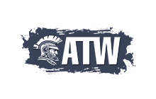
Here is my final logo.
![]()
My old logo vs new logo.
![]()


Interesting. Could you explain your process with your logo refinement a bit more? I’m curious about why you set up your guides like that and why you used the pink dots. Was it a way of spacing out your letters?
Good Question. The angled guides in the first example are for the serif down-slopes and top ascenders which are the same angle on every one. Yes the pink dots are for spacing. With every logo I do I always try to make every angle, curve and space as close to perfect as I can. Sometimes it just comes down to judging it with your own eye on what looks right. My new logo was particularly hard because the ‘think’ is thinner and it took a lot of variations to get something I was happy with!